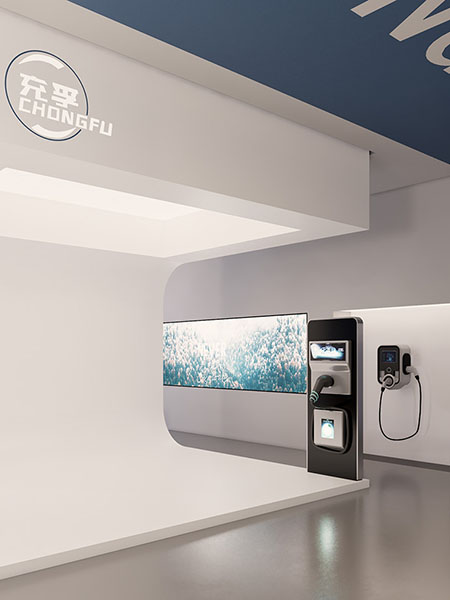
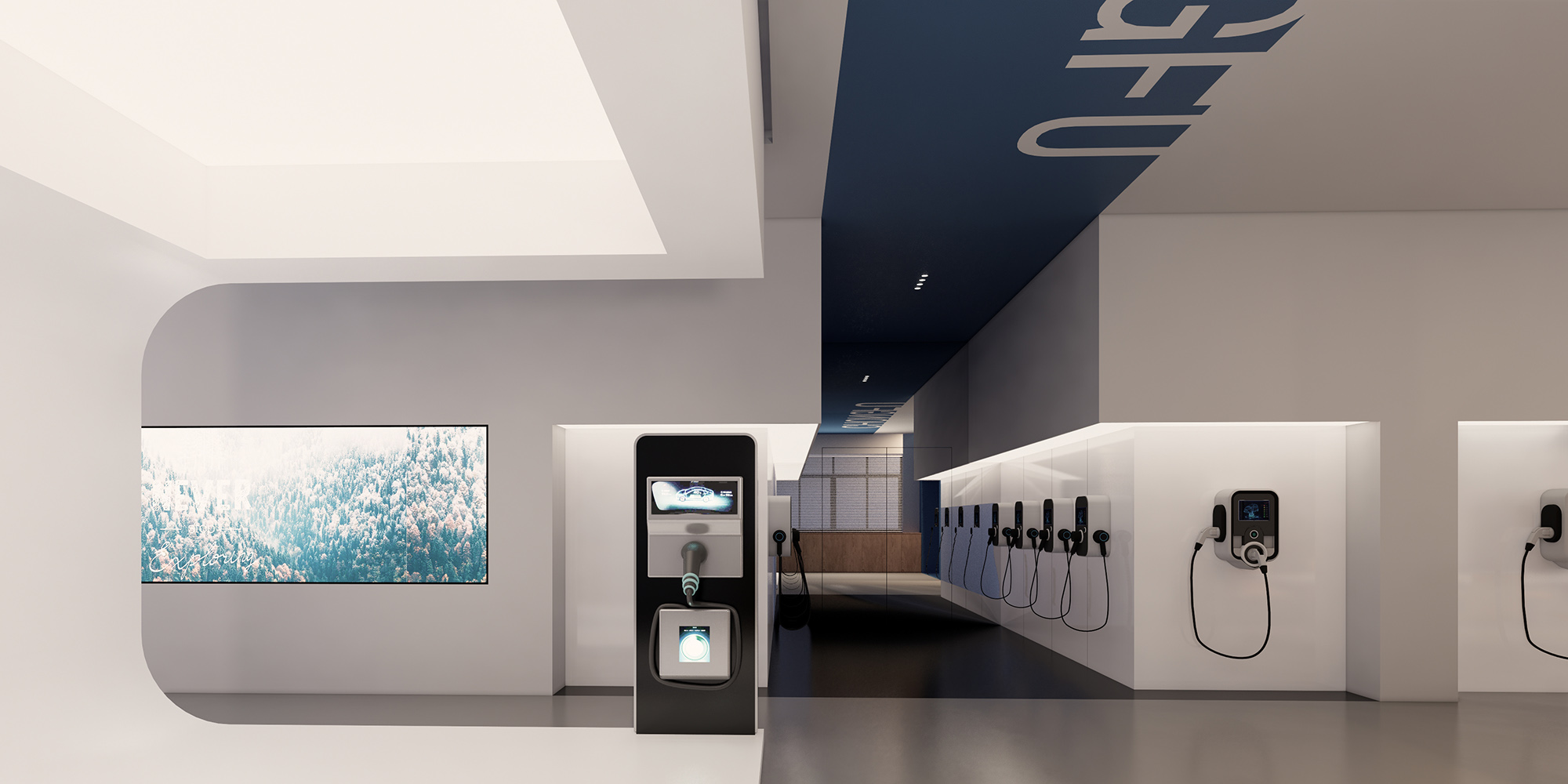
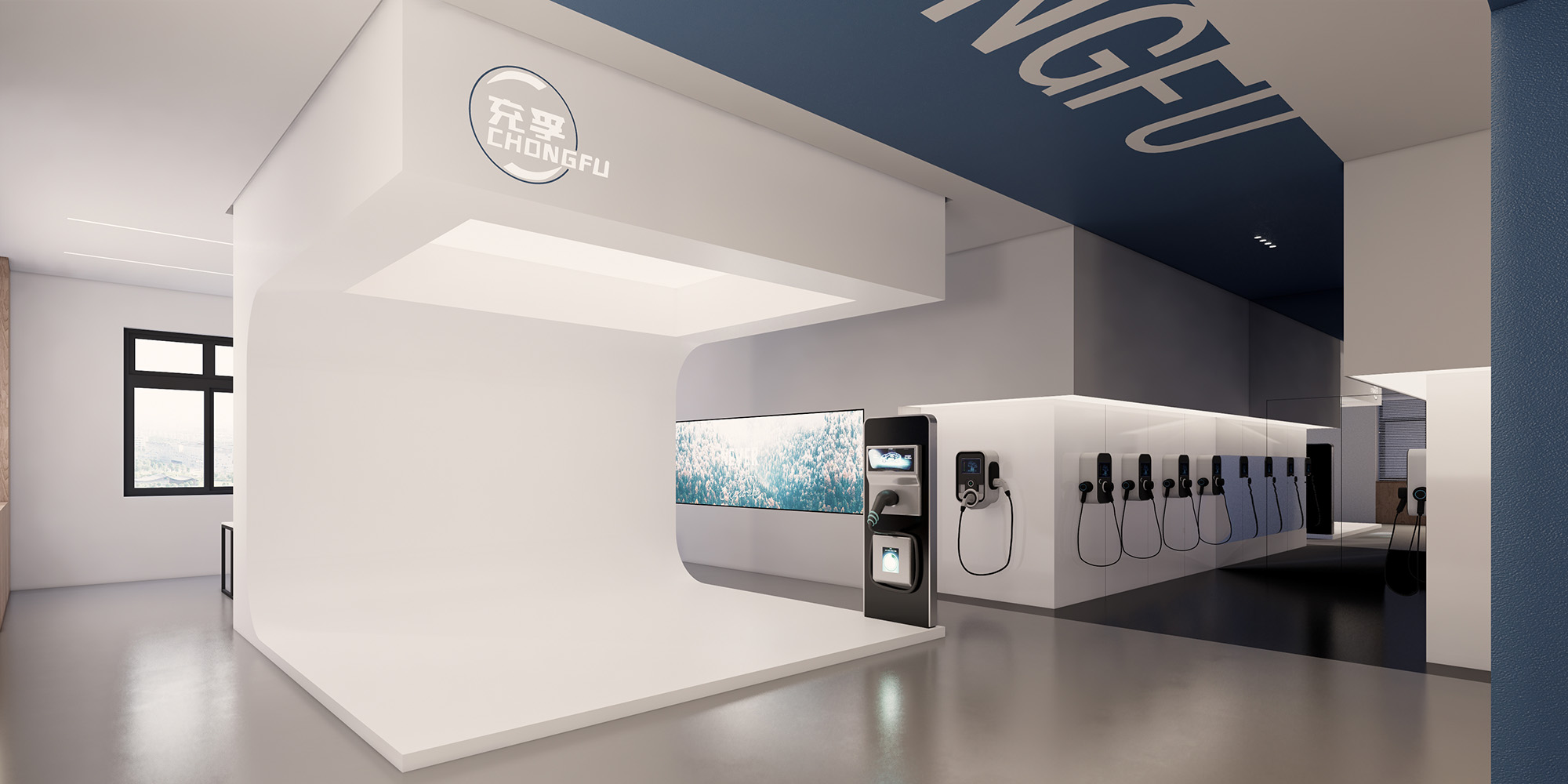
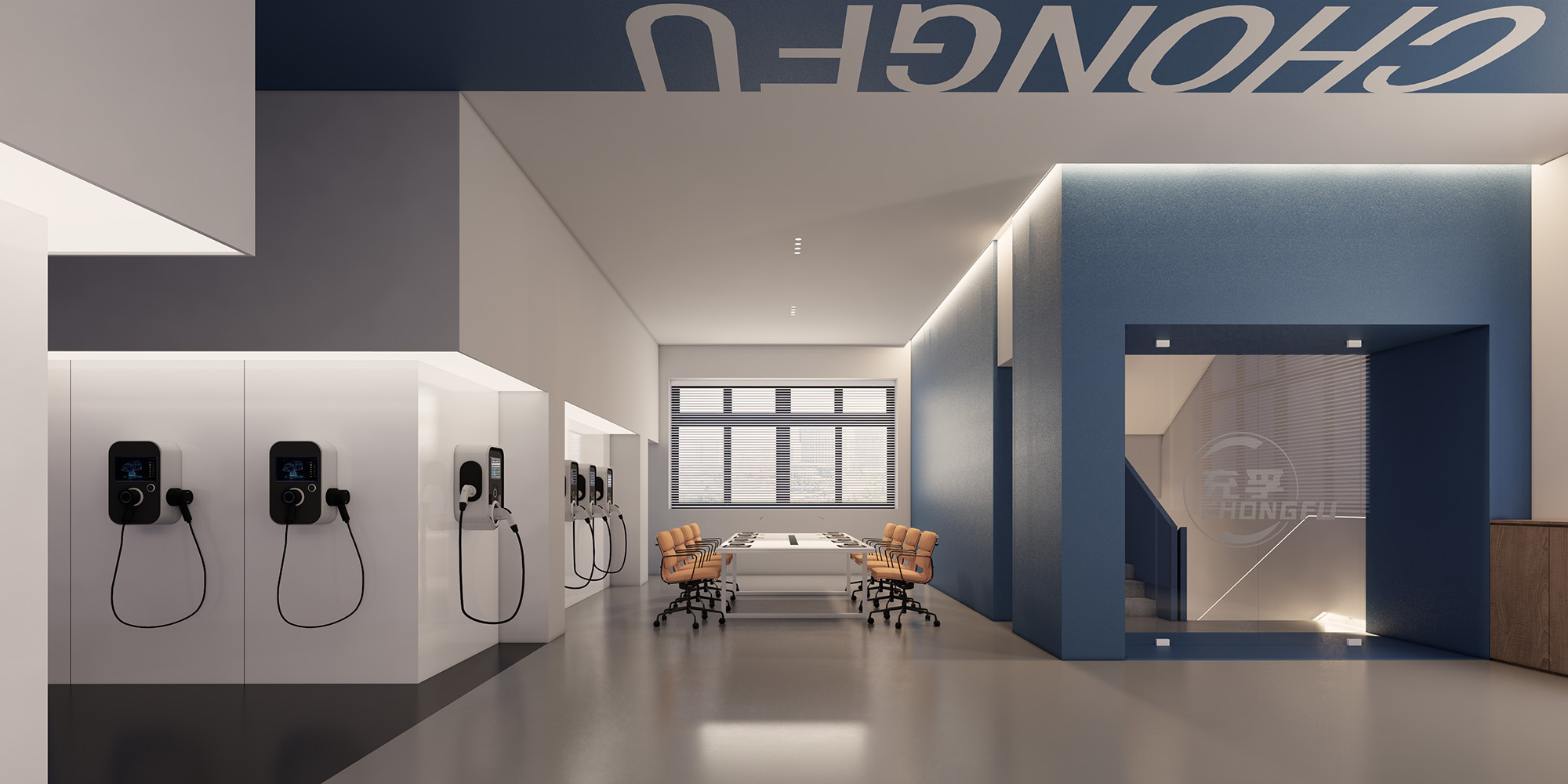
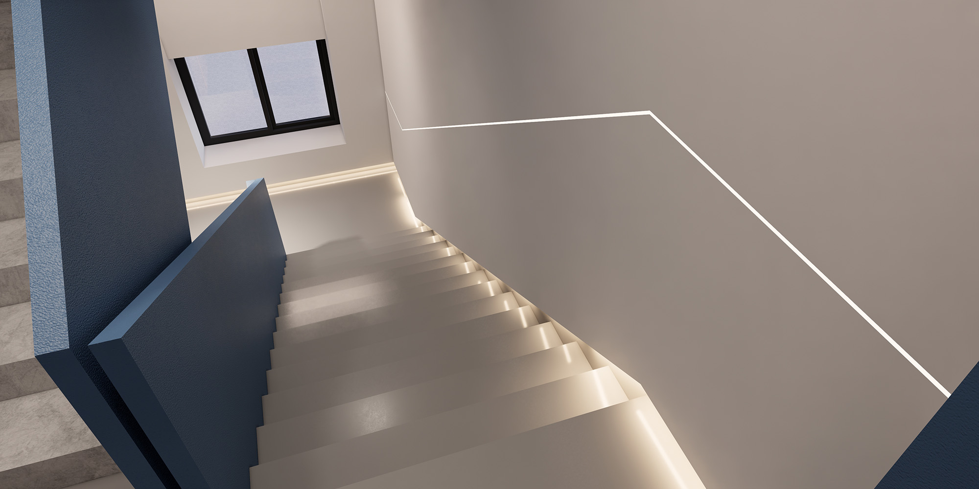
不同的材质
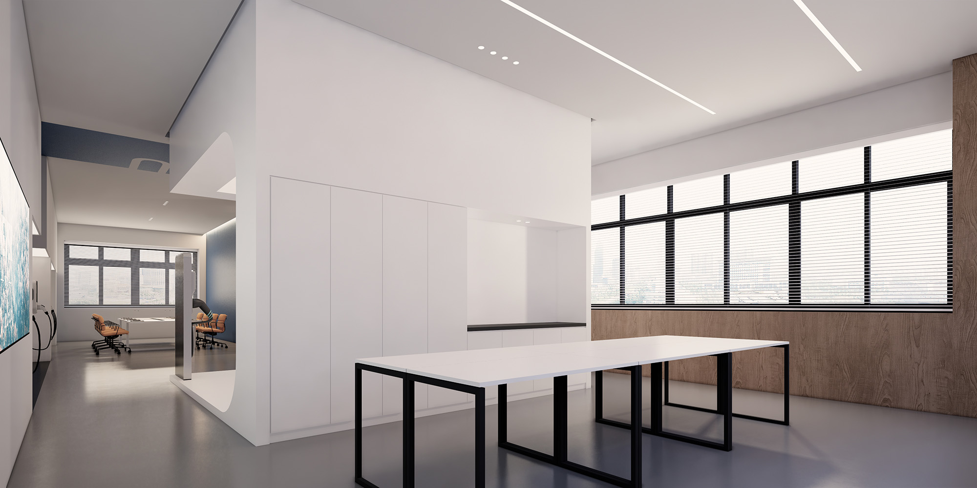
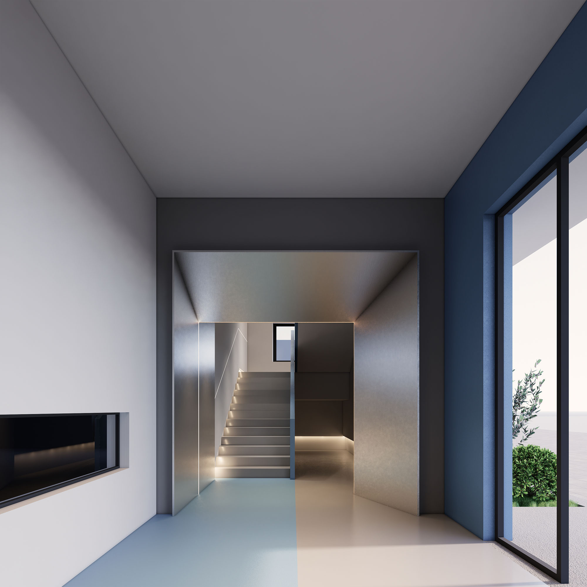
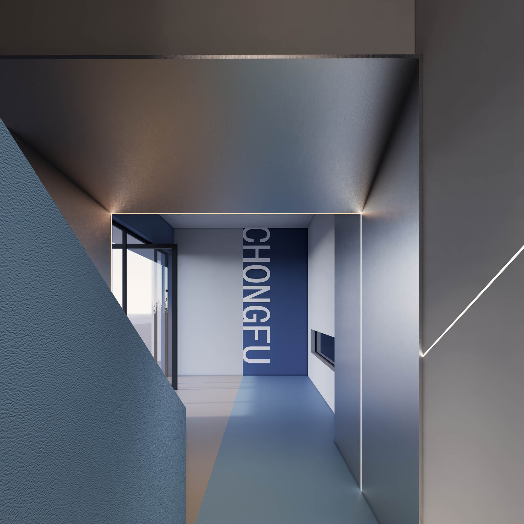
不同的色彩通过比例分配围合形成的盒子空间
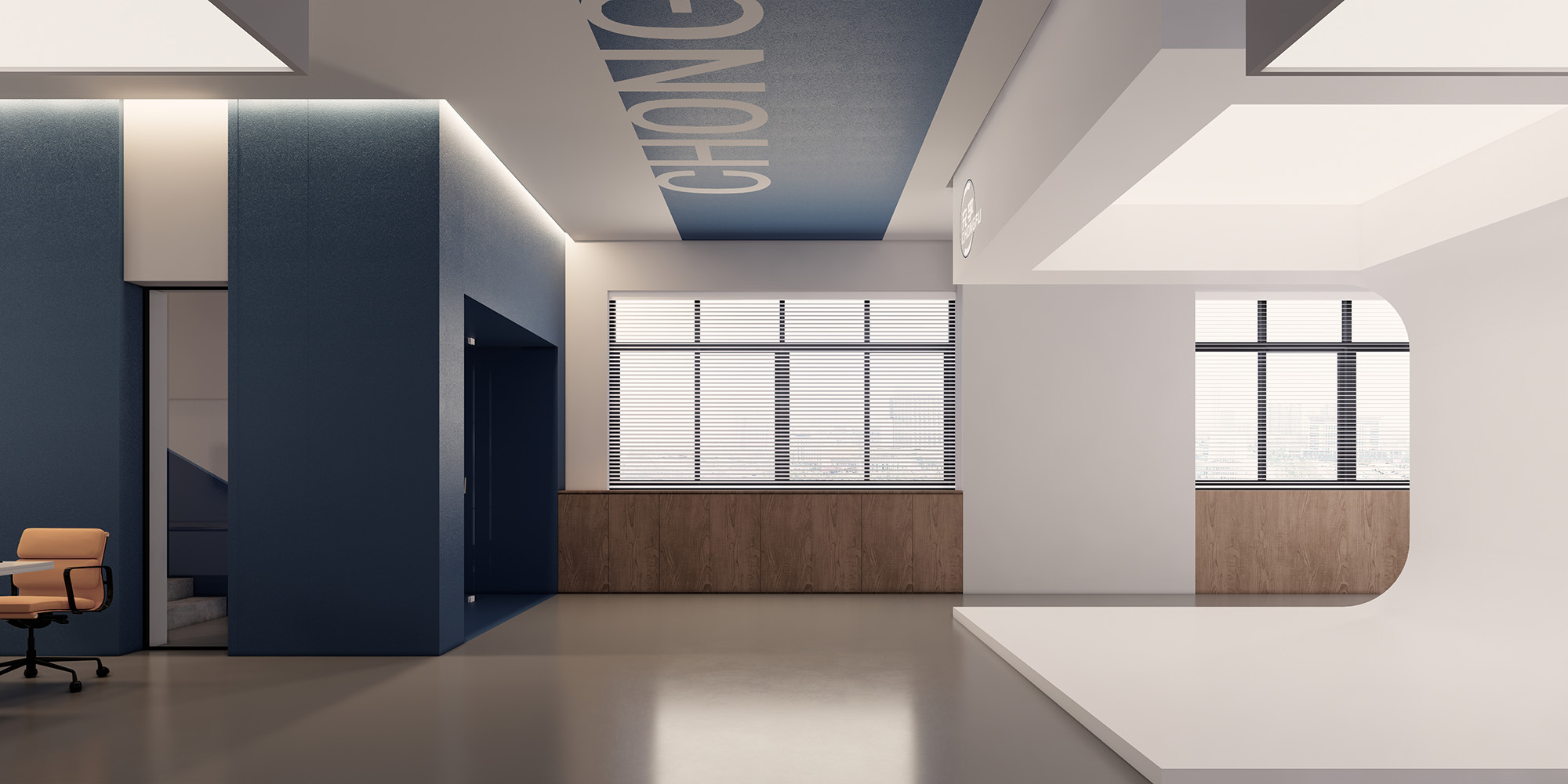
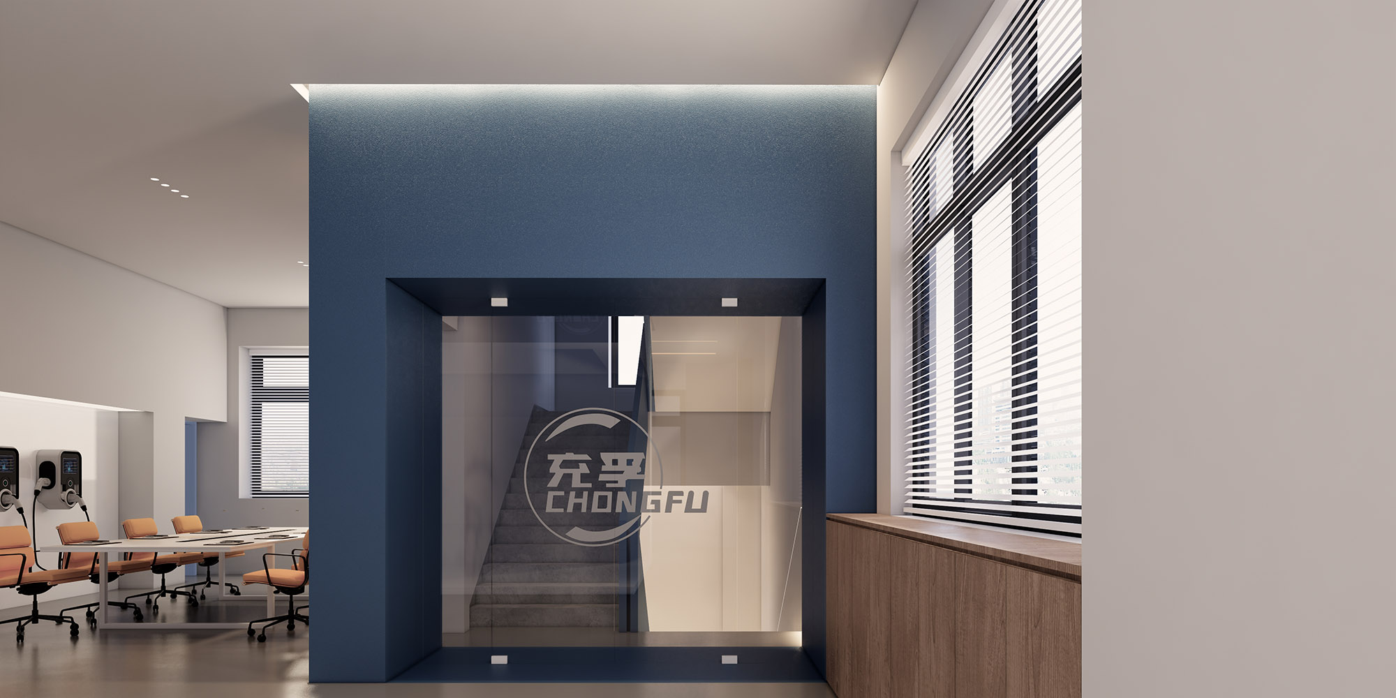
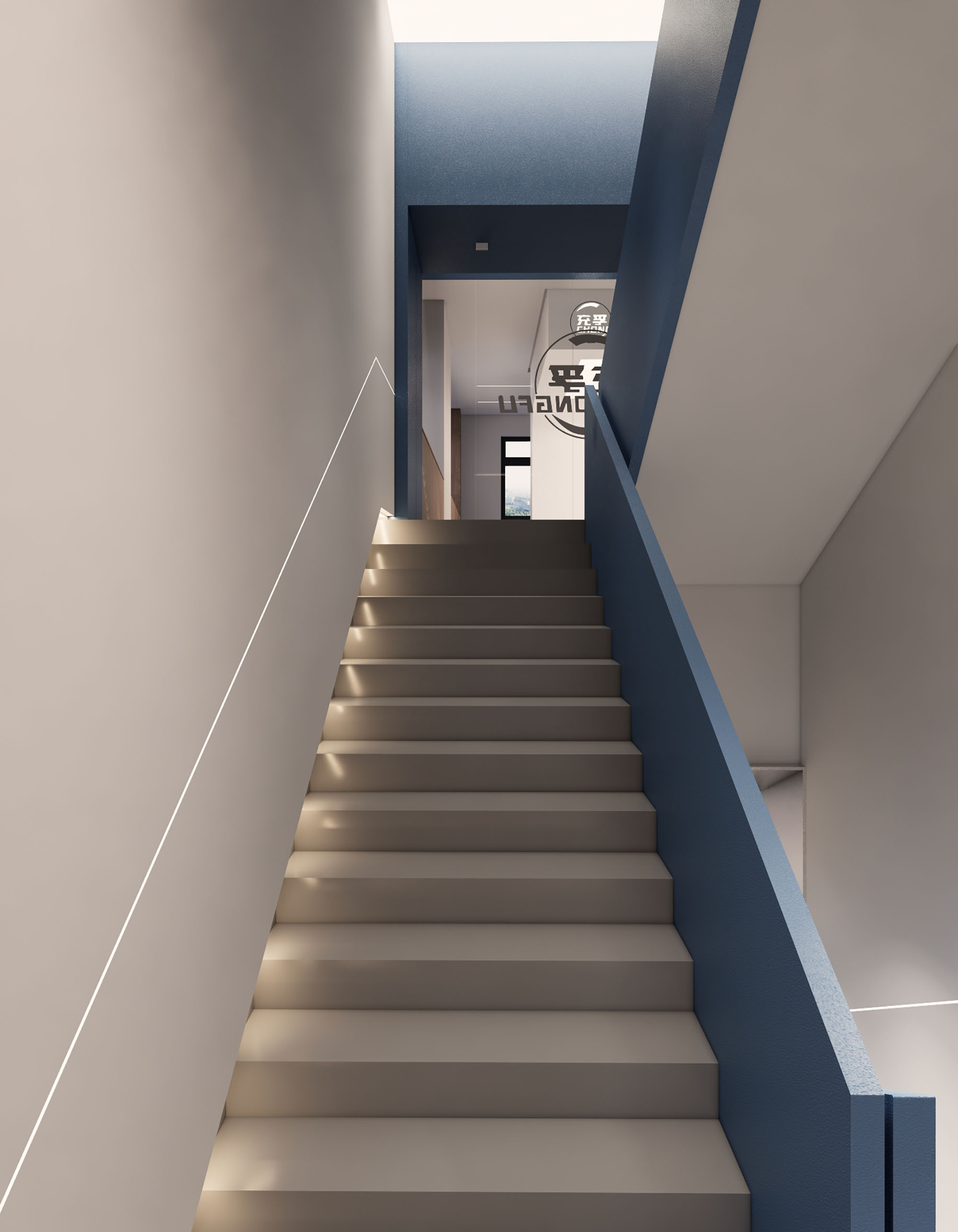
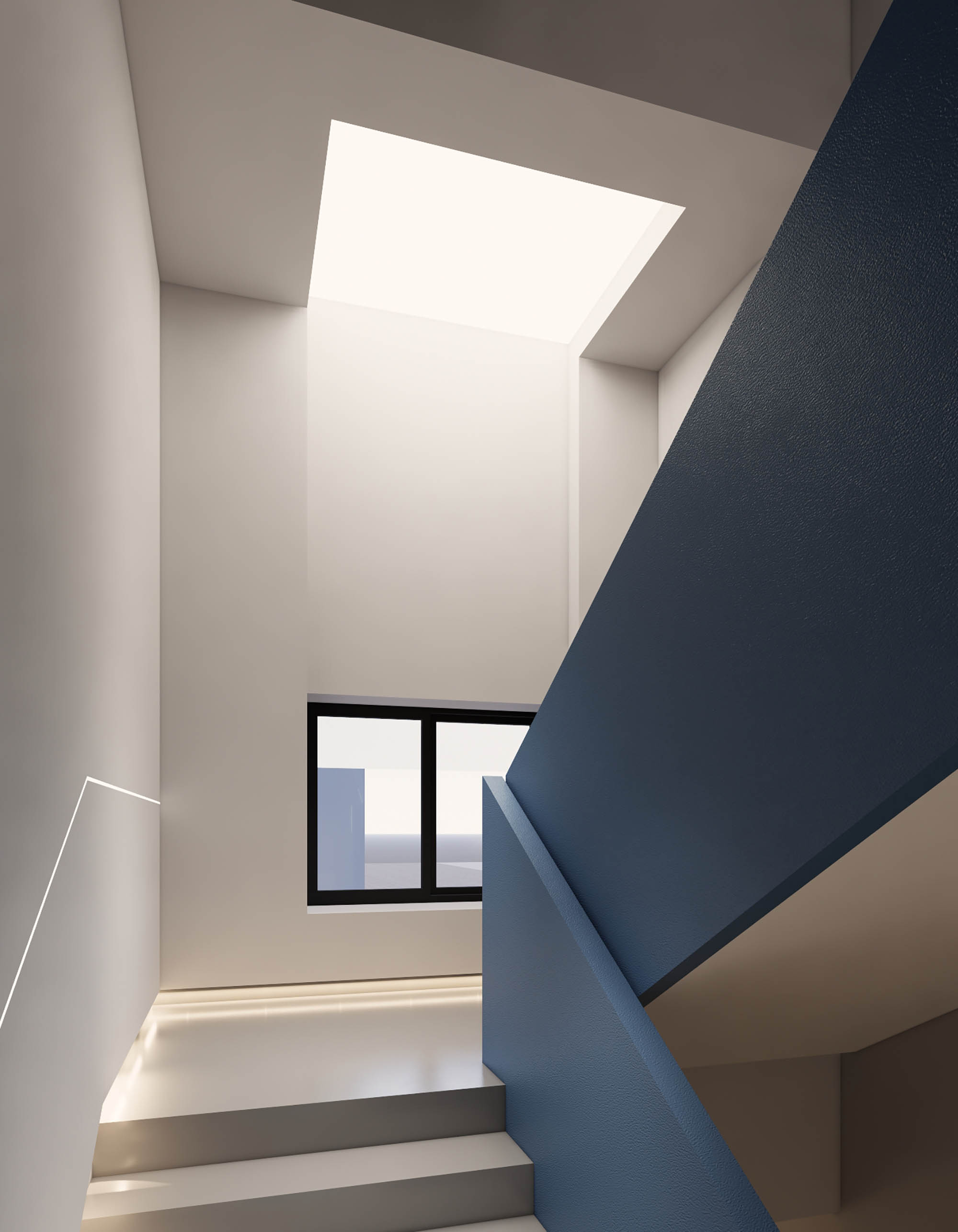
材质色彩上使用标志性蓝色
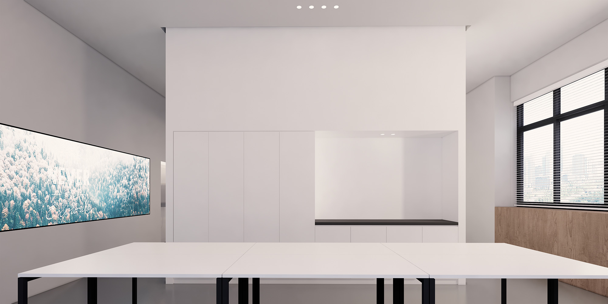
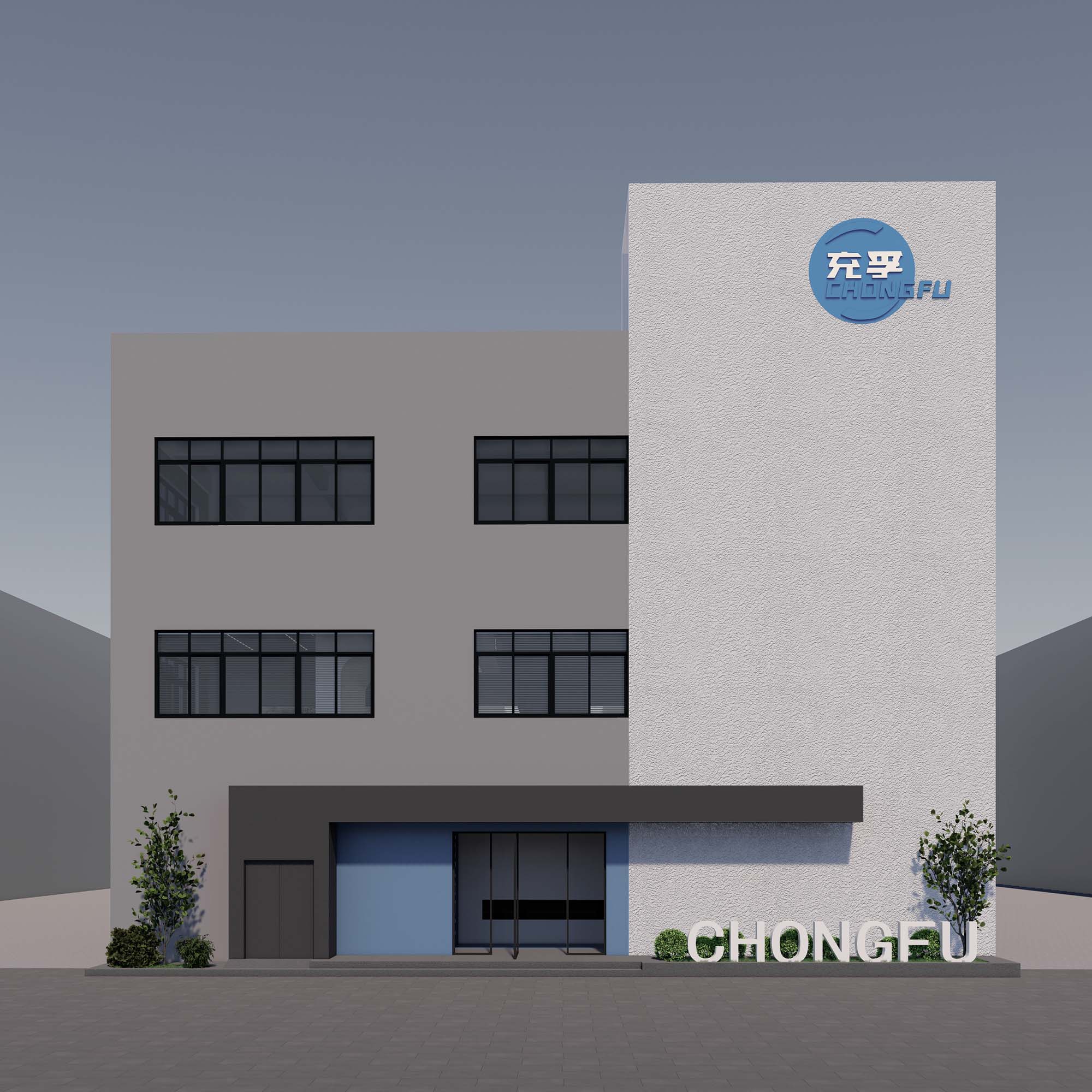
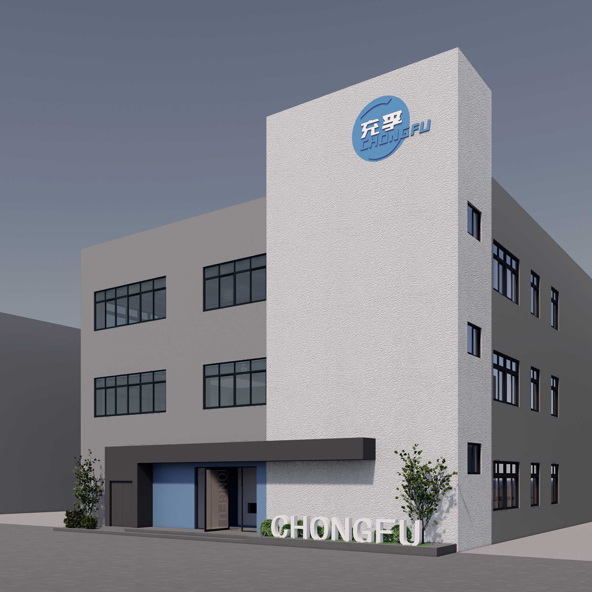
在白色肌理质感与中性灰色材质中添加温馨的木饰面
干净简洁的外立面通过粗糙的肌理增添细节
色彩鲜明的logo更加突显
发光线带贯穿整个空间
主线顶面视觉冲击感的大型vi也将空间进行了动静分区
Different materials
different colors through the proportion of the distribution of the box surrounded by space
Material Color on the use of iconic blue
white texture texture and neutral gray material to add a warm wood veneer
The clean and simple facade adds detail through the rough texture
and the brightly colored logo is highlighted
The light-emitting belt runs through the whole space
and the largescale VI with the visual impact on the top of the main line also
divides the space into dynamic and static zones

